
Implemented Main Street Designs

EXAMPLES OF IMPLEMENTED DESIGNS
Our designs preserve the historic or character-defining features of each building. They are also tempered by the budget that each owner has planned. Often, our designs contain multiple phases that allow the owner to segment the project according to available funds. Below are but a few examples of successfully implemented Illinois Main Street designs. Click on any image, and a window containing larger versions of the three images will appear. For high resolution PDF versions of the below drawings, please see the project archive.
Harpole Building, Quincy
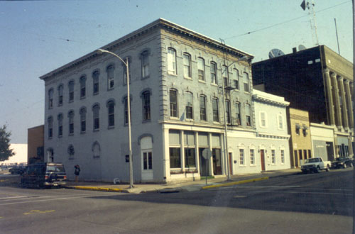
Before

Design

After
Developing an appropriate color scheme for a building can be a great way to accent architectural details. A proposed three-color paint scheme for the building at 601 Vermont in downtown Quincy highlights the historic architectural components of this 1870s three-story brick building. Altered in the 1970s, the building’s storefront was restored in this project. Renovation of this building is a testament to the continuing success of Quincy's facade improvement program.
Shortstop Lounge, Forest Park

Before

Design

After
Many of this building’s original historic details were unnoticeable because they had been painted white. Though the budget for the rehabilitation of this building in Forest Park didn’t allow for major interventions, simply by appropriately painting the details and installing an understated awning, the ornament on the pressed-metal bay window and on the cast-iron columns stands out.
Baker Street, Dixon

Before

Design

After
The design for this modest building includes reinstalling double-hung windows and adding a comprehensive sign scheme. A 1940s silhouette of a waitress proved to be an ideal image for the identity of this new business. The project’s first phase, which included signs at the parapet and in the display windows, has been implemented. The second phase involves the replacing the windows and removing the canopy. The fantastic and historic Edward’s Bookstore sign will be restored and installed inside the building.
Orion Village Hall, Orion
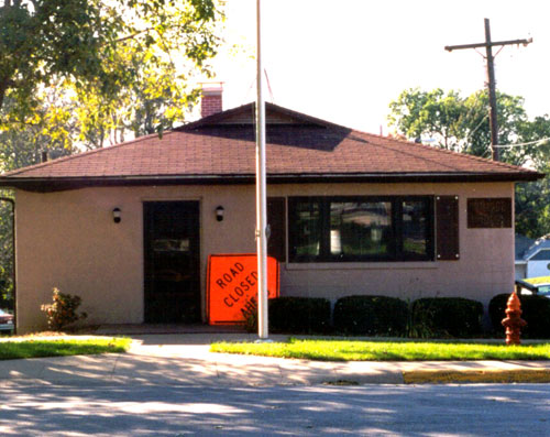
Before

Design

After
This nondescript 1960s concrete-block building did not provide the kind of welcome that one expects from a civic structure. Installing a new facade would have been cost prohibitive. However, by adding landscaping, benches, and lighting, the building is transformed.
Paris Realty, Paris

Before

Design

After
Though this was built as a single building in the 1880s, portions of it had been remodeled, sometimes insensitively, at different times. By applying a cohesive paint scheme to three city lots of this building, the inappropriate additions (like the blank storefront in the center) become less noticeable, while the decorative portions (like the bay window and pressed metal cornice) come to the fore.
Randolph Rich Law Office, Marshall

Before

Design

After
Amazingly, this building had retained its original stone storefront arches since its construction in the 1870s, but they haven’t been visible since they were covered with siding in the 1960s. This rehabilitation removed the siding to reveal the locally quarried limestone. Historic entry doors and cornice were retained and given a fresh coat of paint, along with the upper-floor facade.
Island’s Café, Blue Island

Before

Design

After
This historic building from 1893 has facades entirely sheathed with decorative pressed metal. This rehabilitation restored sections of metal that had been removed in later remodelings. The inappropriate, non-historic storefront, which was too expensive to appropriately replace, was minimized by painting it a dark color and adding a large, but well-proportioned awning. The huge corner sign was replaced with a chaste hanging sign, once so common in downtown districts.
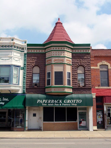
Paperback Grotto, DeKalb

Before

Design
After
A coat of paint can work wonders. The pressed metal turret and cornice of this 1890s building were in very good condition, but looked far worse simply because of failing paint. By highlighting with color the only elements of the storefront that were original (the entrance door and surround on the left) and downplaying the inappropriate, non-historic storefront, the building’s historic character gets noticed. Inappropriate elements that were too expensive to replace appear to recede into the background.